Photograph by Peter Frisby
I've had a great couple of days here in SW Scotland with Peter Frisby from Staffordshire. Peter came to me for some one-to-one tuition. The weather was beautiful and I took him to my favourite hidden cove down on the sea shore on the first day. The light was really spectacular with a pastel blue sky and lots of dramatic clouds. Absolutely ideal for landscape and seascape photography.
Despite the fact that Peter has been taking photographs for only a very short time, he has done a great deal of reading on the subject, so he had a reasonable grasp of the fundaments of exposure.
One of the things that was confusing him was the situation in which a landscape might have a foreground in shadow and a background brightly lit. I explained that there were several methods of dealing with this very common and quite difficult situation. The photographer is faced with a choice of (A) exposing for the shaded area - so allowing the bright background to become over-exposed and 'burnt-out'. This always looks dreadful. (B) Exposing for the brighter area of the picture and allowing the shaded area to go dark. (C) Compromise and interpolate the exposure between the two extremes - rarely very successful. Most frequently (B) is the best.
In the real world, you have several options open to you to combat the problem.
1 - Use a gradual grey filter to darken the bright background in the upper section of the picture.
2 - Put the camera on a tripod and take two shots from precisely the same angle. One exposing for the shadows and one exposing for the highlights. These can then easily be put together in Photoshop using the Layers Mask. This is a highly effective and probably the best way of doing the job.
3 - Expose for the highlights and - if the foreground is not totally black - subtley lift some detail back into this area using Photoshop's Dodge Tool facility. I work on the principle that an under-exposed area of an image can be lightened to reveal detail, while an overexposed, burnt-out, area is just about hopeless.
Peter has not yet got to grips with Photoshop, so when he spotted the photographed the scene above, we had an ideal oportunity to demonstrate option 3. He exposed for the brightly lit far distance, and allowed the foreground to go dark. Once opened in Photoshop when we got back to base, we simply selected the 'Dodge' tool with a large brush at about 8% transparency to lighten the highlights. Several passes were made over the foreground to achieve the results shown. I don't have Peter's original to show you, but I can assue you that foreground really was very dark indeed. Now just in case you are tempted to get all 'precious' and sniffy about 'manipulating' an image in this way, just remember that those icons for the 'Burn' and the 'Dodge' tool come straight from the darkroom. The 'Dodge' icon represents the bit of round card we used to cut out and stick to a short length of stiff wire. Photographic printers would jiggle this 'dodger' about over over a dark area of the print during exposure in the enlarger. The effect was to lighten that area. The 'Burn' icon is a representation of the printer's hand making a hole through which he would direct extra light to a particlular portion of the print in order to darken it. So, you see - there's nothing new about Photoshop - the Victorians were using the same ideas over 100 years ago.
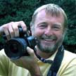
Peter (that's him above at work in Kirkcudbright Harbour) was using an Olympus E-510 and I have to say I was very taken by it. It handles very well indeed and I was impressed by the results. Peter's shot of the shells (below) is needle sharp.
5 Mar 2008
Photographing shadows and highlights
Subscribe to:
Post Comments (Atom)

No comments:
Post a Comment