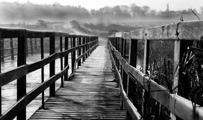
Here are a couple of photographs taken by one of my students, Phil Hallam. Phil came to me for just a one day a couple of weeks ago. I saw this lovely shot as I was looking through some of his photographs – something I always like to do before I start working with a new client so that I know where to start the tuition and coaching. Phil obviously has a good eye for a picture, but he was fairly new to photography and needed guidance. I think this lovely shot shows that he can see a good picture when it presents itself.
I have posted Phil’s original picture as he sent it to me above. But I have just tweaked and cropped a little for the picture below. I just felt that the blank whiteness of all that sky was leading my eye into nothing at the top of the picture, so I have cut it down and darkened some areas a little using the ‘burn’ tool in Photoshop.
The human eye acts very much like a moth – it tends to seek out the light and go to the lighter areas of a composition. This can be very useful once you know how to use it because you can at least try to train your viewer’s eye to explore the areas of the composition you feel are most valuable and relevant to the message you want to convey.

Photograph by Phil Hallam


1 comment:
Those subtle changes have made a good photo even better. The bridge and woodwork have more about them, more impact and substance. The path in the distance, leading away from the bridge into the hills, is clearer and I find my eye drawn to it, following it, and wondering where it leads. Thanks for this example.
Post a Comment