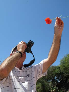
Here is a very short video which I have produced as a bit of an experiment. If there is a positive response to this lively way of getting across information, I will maybe do some more. But we'll see how things go for now.
The idea is to show you what and how I am seeing things from behind the camera and how I think pictures through from the time I spot their potential to the time I press the button. So bear in mind that to do this, the movie camera is on the move and not stationery on a tripod - you are seeing what I am seeing. The aim is to help you see more photographs everywhere.
Of course this could have great potential for the way I post on the blog. Let's see.
Just click the arrow in the middle of the frame below to see this 3 minute clip.
31 May 2008
How to see more photographs - video
27 May 2008
Photography student's success
Margaret came to one of my weekend workshops here in Kirkcudbright in SW Scotland earlier this year. The other day she emailed me hardly able to contain here excitement because one of her photographs had been accepted for publication in the Scotland on Sunday newspaper. This is what Margaret said:
“You helped a lot to inspire me to take more photos, and give me some confidence to send my photos into the paper.
“This photo was taken a couple of Fridays ago at the beginning of May. We live in Ferryhill, Aberdeen and I'd woken early with the sun streaming in through the window, and out of the window saw this fantastic sunrise. I went across the road and that was the view from our street at 5.30am! I took loads of photos while my husband, and daughters were tucked up snugly in bed. The view looks over the rooftops towards the River Dee as it flows under Victoria Road bridge to the harbour then out to sea. The smoke on the right is from an offshore supply vessel. The cranes are all at the docks and the tiny dots are notorious Aberdeen seagulls! I loved the way the cranes and the aerials were leaning towards each other.
“My camera is a Nikon D80, exposure set on manual at 1/1600sec, f7.1, ISO 200, WB set on ‘Cloudy’. The focal length was 112mm.
“The weekend workshop in Kirkcudbright with yourself gave me the oomph to do something with my photos. As you can see I now use my camera in manual, and that's pretty much 99% of the time, and experiment with the white balance, and still take B & W.”
Very well done, Margaret. You have every right to be very proud of yourself. I can still remember the buzz I got from my first publication – and that’s a very long time ago.
Might I have done things differently? Well, perhaps I might have used a slightly different exposure setting, but Margaret has achieved such a beautiful result that any alterations would only amount to fine tweaking.
By using the ‘Cloudy’ White Balance (WB) setting, Margaret has added to the yellow/orange glow from the early morning sun. Great idea. With so much light available, I might have used a ISO 100 for maximum image quality, stopped the aperture down for extra depth of field (this part depends on what Margaret was wanting to capture; maybe she wanted limited depth of field), and used a slower shutter speed. This would have given an exposure of roughly 1/500sec at f11. 1/500sec should be quite fast enough to eliminate camera shake when using a lens with a focal length of 112mm – which on the Nikon D80 is equivalent to about 180mm.
Keep ‘em coming, Margaret. Very well done!
25 May 2008
Timing your photographs - 2
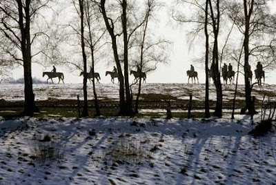
Following on from my previous post about the importance of good timing when taking your photographs, here are a couple of pictures that illustrate another aspect of timing.
Good timing is not only vital in order to capture the precise moment the action is most interesting, but it can also have a profound affect on the composition and atmosphere of the picture.
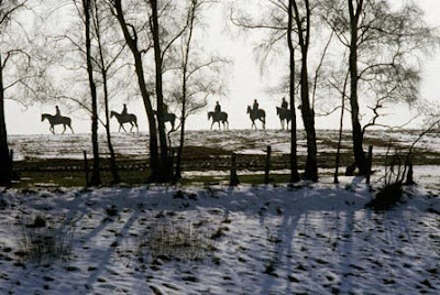
Compare the two photographs taken of racehorses exercising in the Staffordshire countryside very early one winter’s morning. I was delighted to capture the shot of the horses though the trees and against such strong backlighting. The bare trees, the snow on the ground – everything adds to the atmosphere of that winter morning. The horses are walking quite slowly, not galloping, but still the timing is important. In the photograph above, there are more horses than in the shot below, but less is often more in photography, and by waiting until some of the horses had passed out of shot to my left, the composition became cleaner, and because of that the second photograph, below, has more impact.
Also, the silhouettes of the horses to the right of the first picture (above) are not ‘clean’; they are partly obscured by the trees. This has created a degree of confusion and has become distracting. By waiting until fewer horses can be seen more ‘cleanly’ between the trees in the second shot (below), the visual appeal has been heightened rather than reduced.
After taking the first shot, I did not give way to the temptation to follow the horses in the viewfinder in order to make sure I got them all in as they moved to my left, but, as you can see from the foreground, which has hardly changed, I simply waited until some horses moved out of shot and kept the framing almost identical.
22 May 2008
Timing your photographs - 1
19 May 2008
Front or backlight?
16 May 2008
Colour and light
13 May 2008
Photography holiday video
Below is a short video I have put together of some of the photographers on my latest photography holiday in Menorca. It includes several of their photographs and also some of mine. La Mola is an extraordinary place. The old fortifications guarding the entrance to Mahon harbour. The whole place is just bursting with photo opportunities.
So enjoy the video and the photographs - The next holiday will be in September and there are still a few places available.
10 May 2008
Photographing close-ups
Without any question, Rosemary’s amazing abstract image of jelly fish, below, demonstrates that you do not need top-range SLR cameras to produce great pictures. Rosemary was using a Fuji FinePix bridge camera – and an old one at that. This photograph also shows that great pictures are there to be seen in the most unlikely places, and of the most unlikely subjects – if you LOOK. I like to call this ability to see pictures almost everywhere as ‘visual agility’ You can all do it if you try.
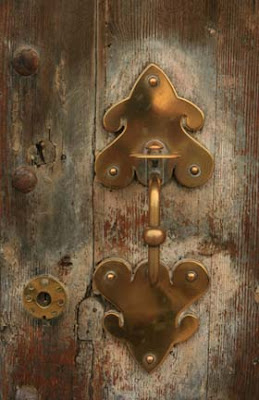 Ande’s two close-ups were taken on a Canon 400D. I confess I have looked at that loading mechanism on the big Vickers gun and never actually spotted its visual potential. Ande did – and a great picture is the result.
Okay, his picture of the door latch is a little more obvious and I would like to think that any photographer worth his salt would have spotted it too. But the fact is Ande not only spotted the picture but he made a cracking good job of capturing it in his camera; it i technically perfect and visually appealing.
9 May 2008
Disgusting photography
Dear Mr. Dunn,
As a long time supporter of Photoactive and its activities, I have to complain most bitterly about the appalling lapse in good taste recently demonstrated in your blog.
A man's bottom indeed!
I am absolutely horrified!
Disgusted of Sevenoaks
Ah well, Disgusted, all I can say is that you would be even more horrified if you knew what an elegant, beautiful and seemingly pure-minded lady took the photograph of the man’s bottom. But my lips are sealed.
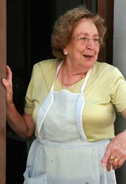
To more respectable photographic matters, here are some more people photographs taken by members of my group in Menorca over the last week. The shot of the little boy in the
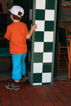 market, and the one of the lady in the apron, were taken by group member Laura during an excursion to the old town of Cuidetella. She was using a Canon 400D with a small telephoto. I love both photographs. The colour combinations and sense of animation in both pictures really brings them to life.
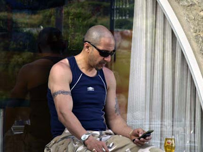
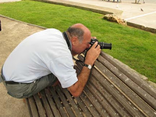
I also like Peter’s picture of the tough guy with the tattoos. Peter is getting so much reward from his photography, and it is a real delight to watch him improving every time we go out to take pictures together. That’s him taking candid shots from the cover of a bench in one of the squares in Mahon, the island’s capital city.
Oh dear, I’ve just realised – it’s another picture of a bloke. I’m going to have disgusted writing to complain again.
8 May 2008
A photograph for the ladies
I keep rattling on about how pleasant and relaxed it is to photograph people here in Menorca. In all the years I have been coming here and whenever I bring my groups of photographers for the photography holidays, there has never been a problem.
Maybe the ultimate in the laid-back attitude was demonstrated the other day when we were taking pictures on a beach and one of the ladies in my group - she shall remain nameless here - spotted the gentleman above. The lady in question told me at the start of the holiday that her favourite subject was photographing flowers, but as a people photographer she seems to have hidden talents. I particularly like the way she was completely unphazed by the fact that the young man baring his bottom had spotted her before she took the picture.
I've said it before but I will say it again... when your subject spots you taking a photograph - press the button again. It is often the response of the subject to being photographed that can make a good photograph.
Oh, it's worth mentioning that none of the blokes on the holiday thought it worthwhile pointing their cameras at this particular subject.
7 May 2008
Photographing strangers
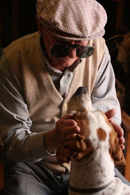
One of the places we sometimes visit is an old shop that sells everything from guns to leather saddles, wicker baskets and wooden mouse traps. It’s a marvellous place to take photographs and we are always made extremely welcome by Lorenzo, the owner, and Paca, his assistant. It's one of those real old-fashioned shops where people come in not just to buy, but also for a chat and a sit down. Lorenzo’s beautiful dog befriends everyone and is always a favourite subject for us. But when the customers sit by the door and talk to the dog – the photographers are in heaven.
When the charming old chap, photographed above, came into the shop, I simply asked him to sit by the door in the soft sidelight and let the photographers get on with it. I believe these situations are for them, not for me, so I always step back and let them move in to get their pictures.
This lovely photograph was done by Laura, who prefers to be called Beannie for some reason. She is very inexperienced behind a camera but possesses the ‘eye’. That is she has a natural flare for a picture. Here is the evidence. I think is absolutely beautiful; full of human tenderness. It has captured a very special moment.
I suggested that everyone set their ISO to at least 400 before they went into the shop – it’s pretty dark in there and it’s impossible to set up tripods. So that extra speed enables faster shutter speeds. Here it has really paid off.
Well done, Beannie. That’s her in the centre of the picture of three of the girls on the holiday. Oh, and below is a shot of Cathy making friends with another dog outside the shop while being photographed by the other Laura on the holiday.
6 May 2008
Menorca Photography Holiday
5 May 2008
How to add colourful foregrounds
 It's tough job, but someone has to do it - I have a group of photographers with me in Menorca at the moment and what a lively bunch they are. All levels of experience, but all dead keen.
Today we’ve been out on the island visiting a farm – not a tourist in sight – before taking a walk around the interesting little town of Mercadel. There’s a white-painted church there and I have often photographed it before. But in front of the church used to be some cactus which could be used as a really dramatic foreground. Someone has ‘improved’ things by cutting down these cactus and replacing them with a hideous concrete path with lights that look like small dustbins. Without a good foreground the church appears very plain and uninteresting from the outside.
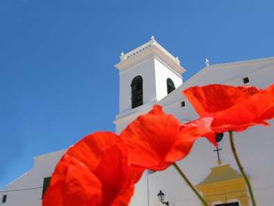
Not to be beaten, I simple found a bunch of wild poppies – they are weeds here – cut a few off and held them in front of the camera. The idea being to give great splodges of red colour with the white church in the background. I thought the combination of bright red, white and blue might make a colourful shot. It did, and I was quite pleased with the results.
My group of snappers saw the results of this simple technique and, of course, they all wanted to try for themselves.
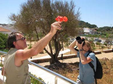
The top picture shows my original photograph. You really don’t need to bother about depth of field with this type of shot. Just splash the colour across your picture in the same way a painter would use a large brush. The flowers do not need to be sharp or in focus.
The centre photograph shows Ande and Cathy helping each other achieve a similar result.
The lower photograph shows Peter going solo with the same technique.
