30 Apr 2008
Cataloguing - Lightroom v iMatch
27 Apr 2008
Photographing water - and music
The short YouTube video below shows Nicola and Catriona, two photographers who came to me a short time ago for a day's tuition. You'll maybe have seen the waterfall before on another video of mine, but I make no excuses for that, it's a fabulous location for photography.
What the video does not show is the terrible fright Catriona - who was heavily pregnant at the time - gave be when she lost her balance and quite literally sat down in the water while she was photographing the waterfall. I saw it all happen and, forgetting all those many years of experience at the sharp end of press photography, dropped the camera and ran to help her onto her feet again. Catriona had a very wet backside, but was laughing at her predicament. I don't ever remember being so frightened. Catriona, being a doctor, must have seen the signs of shock on my face because she was very quick to reassure me she was unhurt, although a bit soggy. I'm delighted to say that all ended well, and last January Catriona gave birth to a healthy baby girl.
The great music on this short DVD is by my good friend Doug Carroll, one of Britain's most talented guitar players. This very morning I got Doug's recording of the music he and keyboard player Owen Fielding have composed and played for my latest instructional DVD, which is in the final stages of editing. Doug's music is fantastic, and worth buying the DVD for by itself. But you'll find that out for yourself when the DVD is out later this year. It will be about portraiture in natural light.
Of course I'll keep you informed about all that nearer the time.
If you'd like to know more about Doug and Mary Carroll's music, click here to go to their website
26 Apr 2008
Photography on the beach - part 2
 A greater problem than the possibility of camera shake will be the task of getting the correct exposure. This is sometimes quite tricky with all that glare from white sand and sea. This will almost certainly confuse your auto exposure settings and will give a false reading on the manual exposure scale. So be prepared to use your Exposure Compensation setting to over-expose by around one stop if necessary. If you are using Manual exposure mode, simply set the exposure on the + plus on the scale by a similar amount. But check on your LCD and with your histogram function to make sure you have the exposure just right. You may have to go into your menu settings to brighten the LCD screen a little so that it will be more easily seen in the bright daylight.
Chances are you will also be shooting in very hard, contrasty sunlight, but the reflections from the sand might help fill the worst of the dark, empty shadows. The old rule about shooting early in the morning and late in the afternoon for the best light is generally a good one, but sunbathers are often out there baking themselves around midday when the sun is blazing down from an empty blue sky – you’ll just have to make the most of it.
Beware the sand and sea – a terribly destructive combination for camera gear. Keep lens changes to a minimum and never change lenses in sea spray or when the wind is whipping up the sand. This is just asking for trouble. Keep cameras out of direct sunlight whenever possible – body and lenses can heat up dramatically and this can do irreparable damage.
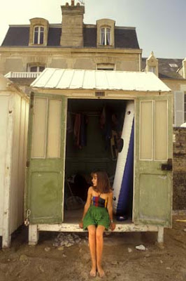
This was a posed photograph taken in Normandy. The composition was kept deliberately simple by choosing an angle facing straight on to the beach hut. The girl was asked to sit down right in the middle of the doorway and look to one side. I liked the shapes and combination of colours
24 Apr 2008
Photography on the beach - part 1
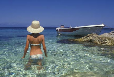
 Do you find sunbathing a bore? Well, why not use your time on the beach to gather lots of pictures during your summer holidays this year?
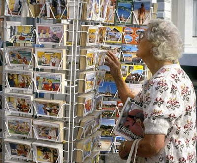
People on the beach are usually there to enjoy themselves – and it’s always easier, and more fun, to photograph people when they are relaxed. But it’s not just people that should be catching your eye – what about all that wonderfully tacky stuff outside the gift shops. Kitsch is everywhere in these seaside shops and everything is deliberately colourful: naughty postcards, silly hats and sun specs; its all there for close-up pictures. Sea walls, beach huts – and the people who use them - promenades and piers have lots of visual possibilities to offer.
No matter if the beach is crowded or nearly deserted, often the best way to start is with a general picture showing the whole beach. If the beach is packed with sunbathers, try using a long telephoto lens to foreshorten and squash up the perspective. This will make the beach appear even more crowded by giving the illusion that the distance between each sunbather is much less than it really is.
Try to find one particular person who will make a good focal point and ensure that he or she is nicely in focus. Then wait for them to do something interesting – throwing a ball for their dog, or setting up their deckchair, for instance. This will help bring vitality to your composition. If you are photographing on a sunny day there will be plenty of light and you will be able to use a fast shutter speed; so freezing the action and avoiding shake with that long lens should not be a problem.
Top photograph
This picture, taken in Bermuda, was very easy to capture, it was just a matter of anticipation. There was no need to disturb the man; he could not see me behind him. Neither could he see the little bird running across the sand. I simply pre-focused on the man and waited for the bird to dart across behind his chair
Middle photograph
Don’t be nervous about moving in close to photograph people. If these two sunbathers had opened their eyes and spotted me taking their picture I would first have pressed the button again to capture their expressions then given them a great big smile and told them what a wonderful photograph they had helped to make
Bottom photograph
There’s no reason why a photograph of the general scene should be just a straight, boring view. Pick out a particular subject, focus on them and wait until they do something interesting before pressing the button. In this case, it was very easy because the lady was throwing sticks into the surf for her dogs
22 Apr 2008
Wide angle for people
This time, though, a wide angle 24mm lens has been used. The action is far more static. It is a reflective moment while the group of camel traders sit together on the ground smoking and talking. This time I wanted to emphasise the arrangement of the four people in the group while retaining lots of information in the background. This background information tells the story of who they are and what their work is.
So I have moved right in and filled my foreground with the wide angle. This has slightly exaggerate the perspective and placed more emphasis on the men themselves.
Of course the men knew I was there and that I was taking photographs. But I had been in the market most of the morning and had build something of a rapport with these people. In the end they were quite happy to let me get on with what I was doing while they carried on working.
My normal way of working is with two camera bodies – one fitted with a wide angle lens and one with a longer lens. This completely cuts out the need to keep changing lenses. It is just a method I have got used to over many years working as a travel photographer with The Sunday Times and for other magazines. There are many conditions in which you simple would not want to change lenses especially these days with the problems of getting dirt on the sensor. The dusty conditions of this market would have played havoc with the sensor of a digital camera.
20 Apr 2008
Telephoto for people
The picture here illustrates what I mean. It was taken on a 180mm f2.8 Nikkor lens. It’s worth saying that in all my travels I cannot remember when I ever carried anything longer. However, a 135mm (or equivalent) is pretty much spot-on for this type of situation when the subjects know full well that you are busy photographing them, but you do not want to get so close to them that your presence becomes obtrusive or, even worse, part of the action itself.
Beside the practicalities of handling yourself in these situations, the small telephoto lens can actually bring a real visual bonus. It can enable you to pick out selective action from the whole scene and - if you get your timing right - bring extra power and impact to your photographs. The limited depth of field of the telephoto does, of course, tend to isolate the main characters and focus your viewer’s attention on the most important aspects of the drama as it happens.
You will always run the risk when using any telephoto of having people move between you and your subject. I can be a risk well worth taking because these ‘intrusive’ elements can often add a feeling of depth, relevance and extra interest. So you must be very aware of what is happening all around you and be prepared to move quickly and decisively to either include of exclude other people.
Obviously, the main subject and focus of interest with this shot is the camel driver and the camel’s growling head. It revolves around the centre of the frame. But there are elements to left and right that add to, rather than diminish the interest of the scene. They give the impression that the action is taking place in a busy, crowded place, and that there are other people involved in the controlling of the camel. And so there were. It is an accurate portrayal of what is going on.
In my next post I’ll show you the exact opposite effect – by using a wide-angle lens during the same event.
19 Apr 2008
FTP for photo blog
Well, we've tried hard to get my blog hosted on my Photoactive website, but, for now, we have had to admit defeat and revert to the way things were. The problem we are convinced from reading the posts on blogger forums lies squarely with Blogger's poor FTP facility.
If anyone with knowledge of hosting a blog on their own website is reading this, I'd appreciate your comments.
We will keep trying and I'll keep you posted.
Thanks for your patience,
Philip Dun
17 Apr 2008
Guiding the eye
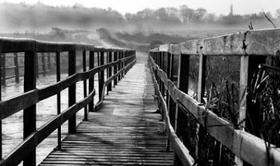
I have posted Phil’s original picture as he sent it to me above. But I have just tweaked and cropped a little for the picture below. I just felt that the blank whiteness of all that sky was leading my eye into nothing at the top of the picture, so I have cut it down and darkened some areas a little using the ‘burn’ tool in Photoshop.
The human eye acts very much like a moth – it tends to seek out the light and go to the lighter areas of a composition. This can be very useful once you know how to use it because you can at least try to train your viewer’s eye to explore the areas of the composition you feel are most valuable and relevant to the message you want to convey.
Photograph by Phil Hallam
16 Apr 2008
Street photography - singing dog
14 Apr 2008
Photographing still life - part 2
It is always best to start the composition very simply and add one thing at a time until you are happy with the result. For the top pictures, I just leaned a plank of old wood at the back of the bench placed the horse on the bench in front of it. I liked the combinations of subtle blue colours. Following the blue colour theme I then hung a coil of blue rope on the background to add another shape and colour – see lower picture. I prefer the simplicity of the first shot.
It’s a really useful idea to gather together a collection of still life props. Almost anything that attracts your eye might come in useful – a small piece of driftwood, a colourful pebble or two, dried flowers, a few different fabrics for background and foregrounds. Every one might be used at some time when you really get into still life photography.
Below is a photograph using one of the many props I have collected in my shed for still life photography. It is just a an old tea chest half-full of unglazed pot jugs. I have cut away two sides of the box to reveal the jugs inside and make it easier to
10 Apr 2008
Photographing still life
You do not need a studio with expensive lighting set-ups to produce interesting still life photographs. A kitchen table; spare room; a garage or even an old shed? Provided you’ve got enough room in there to put up a tripod, it will do just fine. Ideally the space will have a window that does not get direct sunlight, but even this can be softened to some degree by taping a couple of layers of net curtain or sheet of tissue paper over the window. Even an ordinary tungsten lamp can be used as your light source, but you will have to set your white balance to ‘Tungsten’ to correct any nasty orange colour casts from this low temperature light source.
In your makeshift ‘studio’ you will have total control of your subject, your composition and lighting. You will be able to choose your own backgrounds and decide on your own props. You will be able to mix and match colours and spend as much time as you feel you need to create the picture you want. The best way is to experiment and move your chosen objects around until you feel you have completely exhausted every last possibility.
The great joy of using digital is that you can review your results constantly and make adjustments as you go along. This means that your camera becomes a real learning tool and you can delete anything that is obviously not working.
Top photograph:
6 Apr 2008
A career in photography - 3
Well, you asked for it... here is the 3rd part of the story of how I got into photojournalism:
Despite having a clear idea of what I wanted to do, it was still compulsory for all school leavers to attend an interview with the careers officer, who had an office in a grim brick building at the back of the hospital morgue. I presented myself there for an appointment with Mr. Turton, the Chief Careers Officer, on the stroke of nine one wet Monday morning. I have changed this man’s name because he was an incompetent idiot.
It was all a waste of time, I thought, but at least it got me out of school for the morning. Then, as I climbed a well-worn wooden staircase to this man’s office, it dawned on me that maybe I might be able to enlist his help. Surely he would have some contacts within the local weekly newspapers. Perhaps he would know someone I could write to, or talk to for advice. My hopes of breaking into a career in photography came flooding back as I mounted those stairs.
Now I stood in a gloomy office whose grime-streaked sash window overlooked the hospital morgue. Behind a battered, ink stained pine desk sat the great man, Mr. Turton, himself.
I tried to take in what he was telling me.
“No, no, no, lad. That’s not for the likes of you.”
He was a large, florid man. He pushed his chair back from the desk, put his thumbs behind his braces and let out a great boom of laughter. He leaned the chair so far back on its two back legs that they creaked under the strain of his great fat body. I hoped that they might snap and he would topple over backwards onto the floor. I had just confessed to this man my ambitions to become a professional photographer, my desire to travel, and my plans to work my way up the professional ladder to work in what was then the world’s pinnacle of journalism - Fleet Street.
“Now, let’s be more sensible,” he said, still shaking his great fat head and heaving his shoulders as he tried to contain his amusement. He lowered his chair back onto all fours with a bump and became businesslike, shuffling though papers.
“I really don’t know who puts some of these daft ideas into boys’ heads. Now, these are more like it,” He said picking out two cards. “There are some ‘prenticeships going at the engineering works, and they are looking for likely lads at the bakery. That’s more your line, you know. I’ll put you down for the bakery, shall I? What do you say? Nice steady job. You won’t regret it. Then you can tell your mam you’ve got a proper job and can bring a bit of a wage home every week to help her with the housekeeping.”
Anger, rage, humiliation, all welled up inside me. I was fourteen years old and felt foolish and small in front of this big, ignorant man who wanted to consign me to a life of wholemeal baps and bread trays. The tears welled in my eyes, I tried to speak, but couldn’t get the words out. I looked at Mr Turton through an increasingly red haze of hatred and despair. Then, all the frustration rushed to the surface and I blurted out:
“You can put me down for what you like, Sir, but I shan’t be going to no bakery. And I’ll tell you what, I’ll come back and laugh at you when I’m a press photographer in Fleet Street.”
The expression on Mr Turton’s face showed his shock and utter disbelief. His flabby jaw dropped. He started to squeeze out of his chair. His florid face flushed even more and his cheeks went purple.
“Well you cheeky little bugger, I’ll…”
But I didn’t wait for him to finish, I turned and fled out of his office, down the stairs and out into the rain.
The headmaster sent for me when I got to school that afternoon. Mr Turton had been on the phone with a vivid report on my behaviour.
I was publicly caned on stage in front of the entire school for, among other things, insubordination, bringing the school into disrepute, lack of respect… the list was a long one, and so was the cane. Every stroke of that rod across my backside fired my determination to succeed. I’d show the stupid buggers.
3 Apr 2008
Wildlife photography

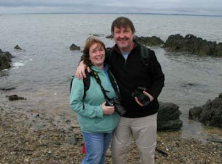
Photograph by Kirsty Kimberley
Before I start a day of tuition with my 'students' I like to take a look at some of their previous photographs. This helps me see exactly what level people are at with their photography and also gives me a chance to get to know them and discuss the way we can best arrange the day.
1 Apr 2008
Photographing aerial perspective
There are two very different types of perspective, and an understanding of both can be of fundamental importance to the photographer when creating a sense of depth - the third dimension - in our two-dimensional photographs.
Aerial perspective has nothing to do with flying and looking down on your subject, in fact it would be more accurately described as ‘atmospheric’ perspective. It is the phenomenon that creates a sense of depth in a photograph by capturing the way the atmosphere makes distant objects appear less distinct and more bluish than those nearer the camera.
Aerial perspective is particularly noticeable with backlight (what nice photographers often refer to as contre-jour or ‘against the light’) in a slightly hazy atmosphere, and you can see its effect very clearly in the photograph above. The figures on the wall are in strong, black silhouette. The mountains behind get gradually lighter the further away they are. This gives a very powerful sense of distance and depth.
Painters and artists have been using this effect for many centuries. In particular, Leonardo da Vinci was fascinated by it and I believe he was the first to use the term. I can bring to mind at least one of his paintings – Virgin of the Rocks, in which he has used it to great effect to give the illusion of tremendous depth within his picture.
I found this interesting techy page about aerial perspective and I suggest you give it a click and learn more…
http://psych.hanover.edu/krantz/art/aerial.html


